The balloon colour combinations that look best in photos use two or three related shades plus one neutral or metallic: blush, white and rose gold; sage, cream and gold; navy, white and silver; or a bright trio like red, yellow and blue for kids. Avoid too many colours, match the palette to the wall behind.
- Two or three colours plus one neutral or metallic is the safest formula.
- The wall and light behind the balloons change how colours appear on camera.
- Pastels need good light; deep shades need contrast.
- Limit chrome to one shade so it does not overpower photos.
Why some colours look great in person but not in photos
Phone cameras adjust exposure and white balance automatically. A room lit with warm yellow bulbs will push whites towards cream and blues towards grey. Very dark colours such as black and navy can lose detail in low light, while neon and very bright shades can look harsh or glowing. Chrome balloons reflect everything around them, including tube lights and people.
So the trick is not just choosing pretty colours. It is choosing colours that hold up under the camera, in the light you actually have.
Balloon colour combinations that work for every occasion
| Palette | Mood | Great for |
|---|---|---|
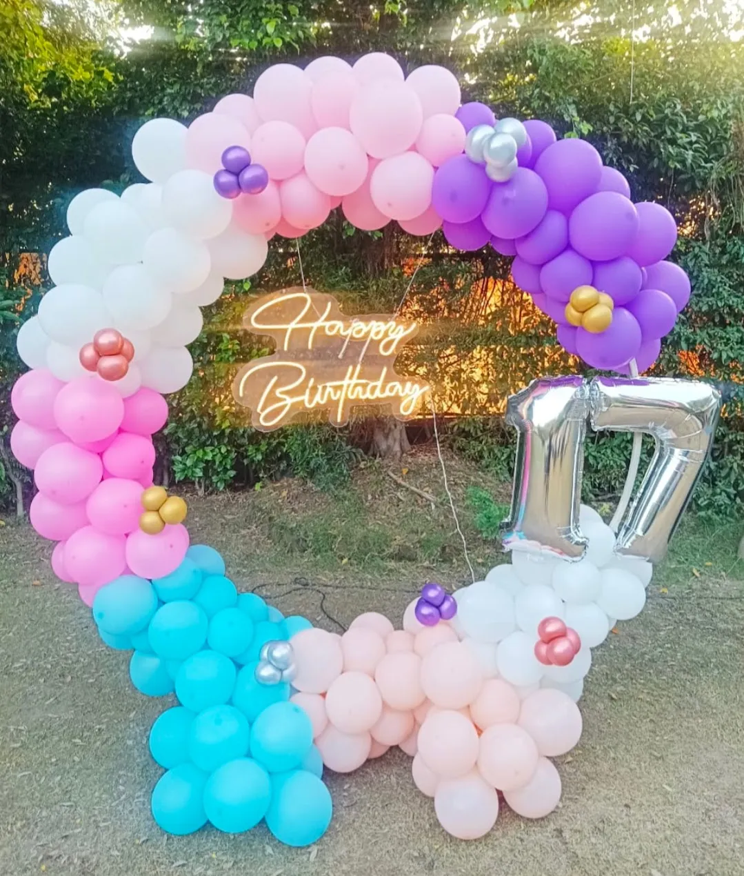
| Blush pink, white, rose gold | Soft, elegant | Girls' birthdays, baby showers, anniversaries |
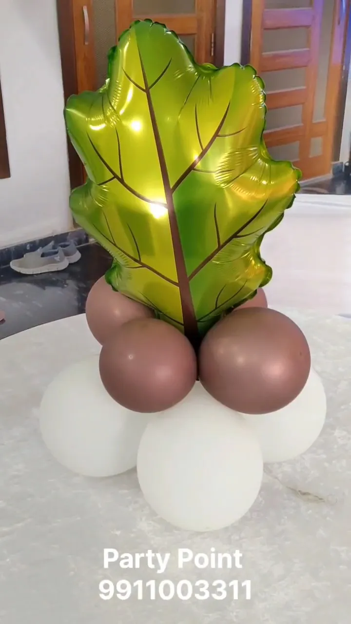
| Sage green, cream, gold | Fresh, calm, modern | First birthdays, adult brunches, naming ceremonies |
| Navy, white, silver | Smart, clean | Boys' birthdays, men's milestones, office events |
| Black, gold, white | Glamorous, bold | 18th, 30th, 40th, 50th birthdays |
| Lilac, baby blue, white | Dreamy, gentle | Unicorn and fairy themes, baby showers |
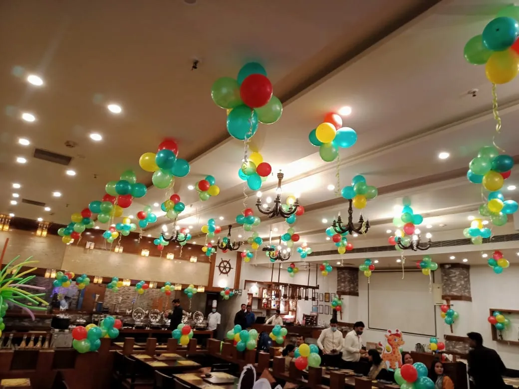
| Red, yellow, blue | Bright, cheerful | Superhero, circus and toddler parties |
| Peach, coral, ivory | Warm, summery | Daytime parties, terrace events |
| Emerald, gold, cream | Rich, festive | Winter and Diwali-season celebrations |
Simple rules that make any palette work
Rule 1: Keep it to two or three main colours
More colours do not make a setup more festive. They make it look busy and harder for the eye to settle. A tight palette reads as designed.
Rule 2: Add one neutral
White, cream, nude or clear balloons give the eye a place to rest and make the other colours pop.
Rule 3: Use only one metallic
Gold, silver or rose gold, not all three. Mixing metallics often looks accidental in photos.
Rule 4: Vary sizes, not shades
If you want depth, use different balloon sizes in the same colours rather than adding new colours.
Rule 5: Think about skin tones
Very saturated orange or yellow right behind faces can reflect onto skin. Softer shades or a neutral panel behind the person are more flattering.
Match the palette to the wall and room
Many Delhi homes have off-white, beige or light-coloured walls, which suit almost any palette. But if your wall is bright, patterned or textured, choose balloons that contrast. Against a dark wooden panel, pastels and whites stand out. Against a pale pink wall, navy or emerald will pop more than blush pink.
If you cannot change the wall, consider a backdrop panel or fabric drape behind the balloons. It creates a clean base for photos.
Lighting and colour
- Daylight: the most honest light. Pastels look their best near a window during the day.
- Warm bulbs: flatter golds, peaches and reds, but make blues and greys look dull.
- Cool white tube lights: make whites look crisp but can make skin look flat.
- Fairy lights and neon signs: add glow and colour casts. A pink neon sign will tint nearby white balloons pink in photos.
Take a test photo of a few sample balloons in the actual room at party time if you can.
Colour ideas by age group
Age gives a useful starting point. Toddlers respond to clear, bright primary colours, so red, yellow and blue or green and orange feel joyful in their photos. Children between six and ten often have strong favourites, so let them pick one colour and build the palette around it with white and one metallic. Teenagers usually prefer moodier, more grown-up shades: black with chrome, deep purple with silver, or monochrome white with neon accents. Adults tend to look best against muted or jewel tones. Asking the birthday person what they like is still the best rule of all.
Picking colours by theme without going overboard
Character themes can tempt you into using every colour in the cartoon. Instead, pick the two strongest colours and pair them with white. A Spider-Man party works in red, blue and white. A Frozen theme looks lovely in icy blue, white and silver. A jungle theme can be green, gold and cream, with animal foils adding the extra colour.
For gender-neutral baby showers and first birthdays, sage, cream, sand and gold have become popular because they look calm and photograph softly.
Colour mistakes to avoid
- Rainbow everything, with no neutral to balance it.
- Gold, silver and rose gold chrome all together.
- Black balloons in a dimly lit room; they disappear in photos.
- Very similar shades that look like a mismatch instead of a choice, such as two slightly different pinks.
- Ignoring the cake colour; a bright blue cake against a pink setup can clash in the main photo.
Checklist before you confirm colours
- Have you chosen two or three main shades plus one neutral?
- Have you picked a single metallic?
- Do the colours stand out against your wall or backdrop?
- Have you considered the party lighting?
- Does the cake, banner and tableware match the palette?
How Party Point can help
We help families pick palettes that suit their room, theme and lighting, and we can show past setups in similar colours so you can see how they photograph. Explore our balloon décor services or our kids theme parties, and browse the gallery for real examples. Starting prices vary by setup, so ask the planner for a quote.
Colour with confidence
Great balloon colour combinations are simple: a small palette, one neutral, one metallic and a clear look at your wall and lights. Get those right and every photo will look intentional. When you are ready, share your theme and colours with us.
Frequently asked questions
What balloon colours look best for a boy's birthday?
Navy, white and silver look smart and photograph well. For younger boys, red, blue and yellow or green, gold and white suit superhero and jungle themes. You do not need to stick to blue; any palette works if you keep it to two or three colours with one neutral.
Which colours should I avoid for balloon photos?
Too many colours together, mixed metallics and very dark shades in dim rooms tend to photograph poorly. Neon colours can look harsh under warm light. Also avoid shades too close to the wall colour, because the balloons will blend in and lose impact in pictures.
Are pastel balloons a good choice for evening parties?
Pastels look softest in daylight, but they work in the evening with good lighting. Add warm fairy lights or a soft front light near the backdrop so the colours do not turn grey. A neutral like white or cream and a gold accent helps pastels hold their shape in photos.
How do I choose balloon colours that match a cake?
Decide the balloon palette first, then share it with the baker. Ask for the cake's main colour to be one of the balloon shades or a neutral like white. A small gold or silver detail on the cake can tie it to a metallic accent in the décor.